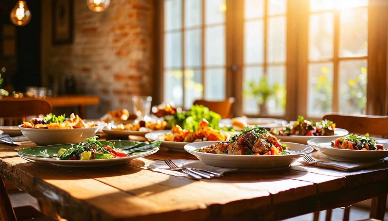
Color is a powerful tool in food photography, capable of evoking emotions, setting the mood, and creating visual impact. Attracting viewers’ attention and making food look appetizing are pivotal in this competitive industry. That’s where an understanding of color theory comes in. By harnessing the principles of color theory, you can take your food photography to the next level and create stunning images that captivate your audience.
In this article, we will explore the fundamentals of color theory in food photography and how it can enhance the quality of your images. We will delve into color relationships, the three primary components of color theory (hue, saturation, and value), and the tools and resources available for exploring color. From understanding color schemes to employing effective food presentation techniques, we will equip you with the knowledge and skills to master color theory in food photography.
Key Takeaways:
- Understanding color theory is essential for creating visually captivating food photographs.
- Color theory involves studying color relationships, hue, saturation, and value.
- Tools like color wheels and online color palette generators can aid in planning effective color schemes.
- Experimenting with complementary and analogous colors can enhance the visual appeal of different foods.
- Customizing your approach to color based on your style and the mood of the image is crucial.
Understanding Color Theory in Food Photography
Understanding color theory is essential for creating captivating and visually stunning images in food photography. By comprehending color relationships and the ways different colors interact with each other, we can effectively harness the power of color to evoke emotions, set the mood, and enhance the overall quality of our photographs. In this section, we will explore the fundamental concepts of color theory and how they can be applied in food photography.
Color Relationships
Color relationships refer to the way colors interact with each other when they are placed together in an image. By understanding these relationships, we can create harmonious combinations and visually appealing compositions. Some common color relationships include:
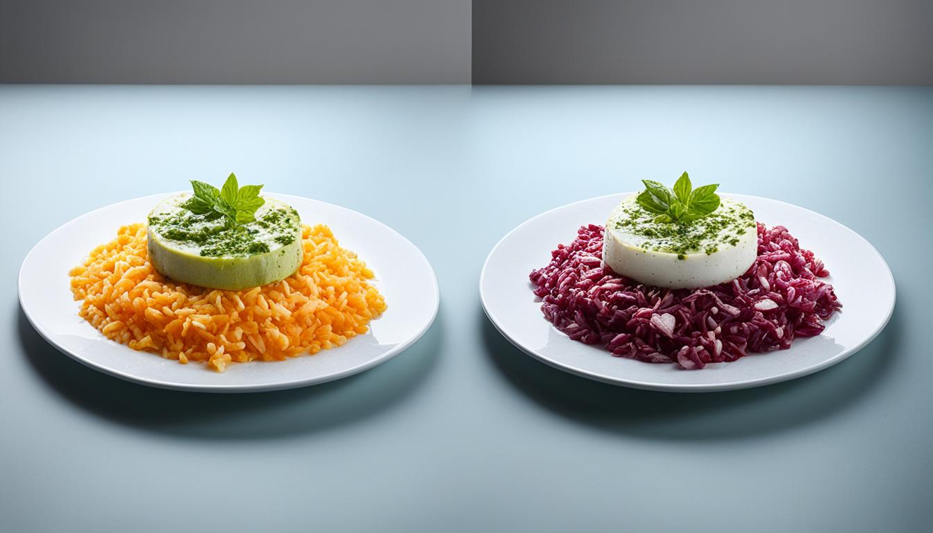
- Complementary colors: Colors that are positioned opposite each other on the color wheel, such as red and green or blue and orange. Complementary colors create strong contrast and can make elements in our food photography images stand out.
- Analogous colors: Colors that are adjacent to each other on the color wheel, such as blue and green or yellow and orange. Analogous colors create a sense of harmony and can be used to create a cohesive color scheme in our photographs.
- Triadic colors: Colors that are evenly spaced around the color wheel, such as red, yellow, and blue. Triadic colors create a vibrant and dynamic color scheme, providing a visually striking effect in our food photography.
The Three Components of Color Theory
Color theory is based on three primary components: hue, saturation, and value.
Hue: Hue refers to the actual color of an object. It represents the position of a color on the color wheel, such as red, yellow, or blue.
Saturation: Saturation measures the intensity or purity of a color. Highly saturated colors appear vibrant and vivid, while desaturated colors appear more muted.
Value: Value refers to the lightness or darkness of a color. A high-value color appears lighter, while a low-value color appears darker.
Understanding these three components allows us to manipulate and control the colors in our food photographs, creating the desired visual impact and conveying the intended mood.
Tools and Resources for Exploring Color in Food Photography
To explore color and plan effective color schemes in your food photography, there are several tools and resources available. Let’s take a look at some of them:
Color Wheels
Color wheels provide visual representations of color relationships and can be a valuable tool for understanding how different colors interact with each other. By using a color wheel, you can easily identify complementary colors (those opposite each other on the wheel), analogous colors (those adjacent to each other), and triadic color schemes (those formed by three equally spaced colors on the wheel). This knowledge can help you create harmonious and visually appealing compositions in your food photography.
Online Color Palette Generators
Online color palette generators, such as Coolors and Adobe Color, offer a convenient way to create harmonious color palettes for your food photography. These platforms allow you to experiment with different color combinations and generate customized palettes that suit your specific needs. Simply input your desired colors or select from pre-existing palettes, and the generator will provide you with a range of harmonious options to choose from.
Studying Renowned Food Photographers
Learning from the work of renowned food photographers and other visual artists can provide inspiration and valuable insights into effective color usage. By examining their portfolios, you can observe how they use color to enhance the visual impact and storytelling in their images. Pay attention to the specific color combinations, moods, and themes they employ to evoke emotions and create captivating compositions. Studying their techniques can help you develop your own unique style and approach to color in food photography.

In this section, we explored some of the tools and resources available for exploring color in food photography. Color wheels help us understand color relationships and create harmonious color schemes, while online color palette generators allow us to generate customized palettes. Additionally, studying the work of renowned food photographers can provide inspiration and insights. In the next section, we will discuss the best color and tone combinations for different types of food.
Best Color and Tone Combinations for Different Foods
Different types of food can be visually enhanced and made more appetizing by using specific color and tone combinations. By understanding the principles of color theory in food photography, we can create images that are visually appealing and captivating to our audience. Let’s explore some of the best color and tone combinations for different types of foods.
Fresh Fruits and Vegetables
When photographing fresh fruits and vegetables, it’s important to make them visually enticing. One effective way to achieve this is by using complementary colors. Complementary colors are opposite to each other on the color wheel and create a strong contrast. Pairing red and green, for example, can make the vibrant colors of fruits and vegetables pop.
| Complementary Colors | Examples |
|---|---|
| Red & Green | Strawberries, kiwis, cucumbers |
| Orange & Blue | Oranges, blueberries |
| Purple & Yellow | Grapes, lemons |
Comfort Foods
Comfort foods often have warm and earthy tones that can create a cozy and inviting atmosphere in your photographs. Use colors like browns, beiges, and deep reds to enhance the feeling of comfort and warmth. These colors complement dishes such as stews, roasted meats, and baked goods.
| Warm and Earthy Tones | Examples |
|---|---|
| Brown | Chocolate, coffee |
| Beige | Pasta, bread |
| Deep Red | Tomatoes, red wine |
Light and Refreshing Dishes
If you’re photographing light and refreshing dishes, such as salads or smoothies, using cool and fresh tones can convey a sense of freshness and vitality. Colors like blues, greens, and pastel hues evoke a cool and calming atmosphere that complements these types of foods.
| Cool and Fresh Tones | Examples |
|---|---|
| Blue | Blueberries, blue cheese |
| Green | Lettuce, avocados |
| Pastel Hues | Macarons, delicate desserts |
By understanding color theory and experimenting with different color and tone combinations, you can create visually stunning food photographs that appeal to your audience’s senses. Remember to consider the type of food you’re photographing and the emotions you want to evoke. Embrace the power of color to make your images stand out and tell captivating visual stories.
Customizing Your Approach to Color in Food Photography
While understanding color theory and exploring various color combinations is important, it’s equally crucial to customize your approach to color based on your unique style and the story you want to tell through your food photography. As photographers, we have the creative freedom to use color to enhance the mood, convey emotions, and reflect the personality of the dish.
Consider the overall mood you want to create in your image. Is it bright and energetic, or calm and serene? Think about how color can contribute to this mood. Warm colors like reds and yellows can evoke feelings of warmth and energy, while cool colors like blues and greens can create a sense of tranquility and freshness.
Theme plays a significant role in food photography. It helps to define the purpose and message of the image. Think about the theme you want to convey and how color can align with it. For example, if your theme is “tropical paradise,” vibrant and tropical colors like oranges and vibrant greens can enhance the theme and transport your viewers to a tropical destination through your photograph.
Your food photography has a narrative, and color can be a powerful tool for telling that story. Consider the story or message you want to convey through your dish. Is it a hearty and comforting recipe that brings back childhood memories? Earthy and warm tones like browns and deep reds can evoke a sense of nostalgia and coziness. Alternatively, if your dish is light and refreshing, using cool and pastel hues can convey a sense of freshness and vitality.
We encourage you to embrace experimentation and trust your artistic intuition. Color is highly subjective, and there are no hard and fast rules. Allow your creativity to guide you and explore unconventional color schemes. Sometimes breaking the rules can result in the most captivating and visually stunning images.
Remember, as food photographers, we have the power to create a unique visual language through color. Every photographer has their own style, and customization is the key to developing a distinctively recognizable aesthetic. Use color to elevate your composition and make your images stand out.
Customizing Color for Different Moods and Themes
| Mood | Color Palette |
|---|---|
| Bright and Energetic |
|
| Calm and Serene |
|
| Hearty and Comforting |
|
| Light and Refreshing |
|
Image:
Enhancing Color in Food Photography with Photoshop and AI
Continuously improving your Photoshop skills and retouching abilities is essential for a food photographer, particularly when working with color. Photoshop allows us to fine-tune colors, adjust saturation and tonal values, apply creative filters, and perform precise color correction. Additionally, with the advancement of artificial intelligence (AI), there are now AI-powered tools that can assist us in color enhancement and manipulation. These tools intelligently analyze and suggest adjustments to color balance, saturation, and tone mapping, saving time and providing a starting point for further customization.

| Benefits of Photoshop for Color Enhancement | Benefits of AI-powered Tools for Color Manipulation |
|---|---|
|
|
By leveraging the capabilities of Photoshop and AI-powered tools, we can elevate the color quality in our food photography to create striking and visually captivating images. These technologies provide us with the flexibility to enhance colors according to our creative vision and achieve the desired atmospheric effects for our food compositions.
Conclusion
Mastering color theory in food photography is a skill that can have a significant impact on the visual appeal of your images. By understanding the principles of color theory and utilizing tools and resources to explore color, you can create captivating and stunning food photographs that stand out in the photography industry’s evolving landscape.
Customizing your approach to color based on your unique style and the story you want to tell allows you to create a competitive edge. Consider the mood, theme, and narrative of your image, and leverage the power of color to convey specific emotions and reflect your dish’s personality.
Furthermore, embracing the role of Photoshop and artificial intelligence (AI) in color enhancement can further enhance your photography. Continuously improving your Photoshop skills and exploring AI-powered color manipulation tools can save time and provide new opportunities for creativity.
Remember, color is a powerful tool. By utilizing color theory, customizing your approach, and staying current with industry trends, you can captivate your audience and tell compelling visual stories through your food photography.
FAQ
What is color theory in food photography?
Color theory in food photography involves understanding color relationships and how different colors interact with each other to create visual impact.
What are the three primary components of color theory?
The three primary components of color theory are hue (the actual color), saturation (the intensity or purity of the color), and value (the lightness or darkness of the color).
What tools and resources can I use to explore color in food photography?
Color wheels, online color palette generators, and studying the work of renowned food photographers can help you explore color and plan effective color schemes.
What are some recommended color and tone combinations for different types of food?
Pairing complementary colors like red and green or experimenting with analogous colors such as orange and yellow can make fresh fruits and vegetables visually enticing. Warm and earthy tones like browns, beiges, and deep reds can create a cozy and inviting atmosphere for comfort foods, while cool and fresh tones like blues, greens, and pastel hues can convey freshness and vitality in light and refreshing dishes.
How can I customize my approach to color in food photography?
Consider the overall mood, theme, and narrative of your image. Think about how color can enhance the composition, convey specific emotions, and reflect the personality of the dish. Embrace experimentation and trust your artistic intuition to create a visual language that is distinctively yours.
How can I enhance color in food photography using Photoshop and AI?
Photoshop allows you to fine-tune colors, adjust saturation and tonal values, apply creative filters, and perform precise color correction. AI-powered tools can also intelligently analyze and suggest adjustments to color balance, saturation, and tone mapping, saving time and providing a starting point for further customization.
Why is mastering color theory important in food photography?
Mastering color theory in food photography is important because it can significantly enhance the impact and visual appeal of your images. Understanding the principles of color theory, utilizing tools and resources to explore color, and customizing your approach to fit your unique style can help you create captivating and visually stunning food photographs.
How Does Understanding Color Theory in Food Photography Help Capture Texture and Detail?
Understanding color theory in food photography texture & detail is essential for capturing the true essence of the dish. The right use of colors can accentuate the texture and detail of the ingredients, making the image more appetizing. By applying color theory principles, photographers can create visually appealing and impactful food images.