Welcome to our guide on composition and background choices in product photography. When it comes to capturing captivating product images, composition plays a crucial role in catching the viewer’s attention and highlighting the best features of your products. In this article, we will explore some essential composition techniques and provide valuable tips to enhance your product photography skills.
Key Takeaways:
- Product photography composition is essential in emphasizing your subject and drawing the viewer’s eyes towards it.
- Utilizing front and central placement of the product can make it the center of attention and create intrigue.
- Choose camera angles that highlight the product’s best features and add depth to your images.
- Using negative space effectively can help draw attention to the product and keep the composition simple.
- Applying the rule of odds by including other items in the scene can create visual interest and tell a compelling story.
Now, let’s dive into each technique and discover how they can elevate your product photography to the next level.
Utilizing Front and Central Placement to Highlight the Product
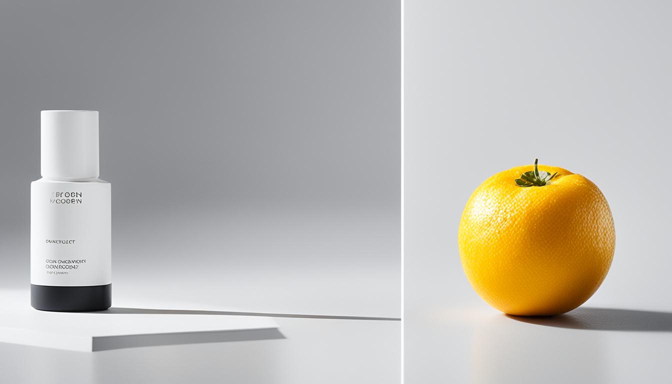
In product photography, it’s important to think outside the box and break away from the traditional compositional rules. One effective technique is to place your product front and center, drawing immediate attention to it. By doing so, you can emphasize the product and make it the focal point of your composition. Whether you’re showcasing the entire product or only a part of it, this approach allows viewers to engage with the image and imagine the rest on their own, creating a sense of curiosity and desire.
When implementing front and central placement, you have the flexibility to position the product in either the foreground or middle ground of your composition. This adds depth to your image and creates visual interest. Additionally, don’t forget to utilize negative space strategically. By incorporating empty areas around the product, you not only enhance the overall composition, but you also guide the viewers’ gaze towards the main subject.
Front and central placement is an excellent way to accentuate the product’s unique features and make it stand out among competitors. By breaking free from traditional composition rules, you can create visually compelling images that draw attention and captivate your audience. Now that you know how to utilize this technique, let’s explore other tips and tricks for composing stunning product photographs.
Choosing Camera Angles That Highlight the Best Features of the Product
When it comes to product photography, camera angles play a crucial role in capturing the essence of the product and highlighting its best features. By selecting the right angle, you can add depth to your images and showcase as much of the product as possible.
One popular camera angle in product photography is the 45-degree downward glance. This angle mimics how our eyes naturally view objects placed on tables or shelves. By capturing the product from this angle, you can create a familiar and relatable perspective for viewers.
However, it’s important to note that not all features of a product may be visible when photographed straight-on or from a top-down perspective. Experimenting with different angles can help you find the sweet spot that showcases the product’s unique selling points.
When choosing a camera angle, consider the product’s shape, size, and key features. For example, if you’re photographing a sleek and slim smartphone, a slightly tilted angle may emphasize its slim profile. On the other hand, a more direct angle may showcase intricate details on a piece of jewelry.
Remember, the goal is to highlight the best features of the product and evoke a desire in the viewer. Visualize how the product will appear from different angles and select the one that captures its essence the most effectively.
Experimenting with Camera Angles
Here are a few camera angles you can experiment with in product photography:
- Low angle: Shoot the product from a lower position to create a sense of grandeur and dominance. This angle works well for products with a strong presence, such as high-end electronics or luxury items.
- High angle: Capture the product from above to give a bird’s-eye view. This angle works well for products that have interesting textures or patterns on the top surface.
- Dutch angle: Tilt the camera slightly to create a dynamic and visually engaging composition. This angle can add a sense of energy and excitement to your product photos.
Remember, there are no hard and fast rules when it comes to camera angles in product photography. Don’t be afraid to think outside the box and experiment with different angles to find the one that best highlights the features and captures the essence of your product.
| Camera Angle | Effect |
|---|---|
| 45-degree downward glance | Provides a familiar and relatable perspective, mimicking how our eyes naturally view objects on tables or shelves. |
| Low angle | Creates a sense of grandeur and dominance, ideal for showcasing high-end electronics or luxury items. |
| High angle | Gives a bird’s-eye view, highlighting interesting textures or patterns on the top surface of the product. |
| Dutch angle | Adds a dynamic and visually engaging element, injecting energy and excitement into the product composition. |
Using Negative Space to Draw Attention to the Product
Negative space is a powerful tool in product photography that allows you to draw attention to your subject. By intentionally leaving empty space in your composition, you can create a visual balance that highlights the product and makes it stand out.
When using negative space, it’s important to keep the composition simple and avoid clutter. This helps direct the viewer’s focus towards the main subject, ensuring that it remains the center of attention. By using space strategically, you can guide the viewer’s gaze and emphasize the product’s features and details.
One effective way to utilize negative space is to leave room for adding text or graphics in post-production. This allows you to create a clean and professional look while still maintaining the focus on the product. Whether it’s a slogan, a call to action, or product specifications, adding text within the negative space can enhance the overall visual impact of the image.
However, it’s important to note that using negative space can be a delicate balance. You don’t want the composition to appear forced or unnatural. Instead, strive for a harmonious integration of the subject and negative space, creating a visually pleasing and engaging image.
Keep an eye on billboards and advertisements to see how professionals use negative space in their compositions. By studying their techniques, you can gain inspiration and insights into incorporating negative space effectively into your own product photography.

Examples of Negative Space in Product Photography
| Product | Description |
|---|---|
| Watch | A close-up shot of a sleek and minimalist watch against a plain white background, with ample negative space surrounding it to emphasize its elegance and simplicity. |
| Jewelry | A necklace resting on a velvet cushion, with plenty of space around it, enhancing the sense of luxury and making the piece the focal point of the composition. |
| Cosmetics | A lipstick tube positioned diagonally across a soft pastel background, allowing the negative space to highlight the vibrant color and sleek design of the product. |
| Food | A plate of food shot from above, with some empty space surrounding the dish, directing the viewer’s attention towards the delicious ingredients and enticing presentation. |
Applying the Rule of Odds to Make Your Product Composition More Appealing
The rule of odds is a valuable technique in product photography composition that can make your images more visually interesting and engaging. By incorporating odd numbers into your composition, you can create visual interest and draw the viewer’s attention to the subject of your photo.
One way to apply the rule of odds is by including additional items in the scene that complement the main product. These additional items can strengthen the concept of your advertisement and help create a story within the image. By doing so, you make the product more relatable and believable to potential customers.
“The rule of odds is a simple yet powerful way to create a visually appealing composition. By using odd numbers, you introduce a sense of asymmetry that adds dynamic energy to your product photography.” – Expert Photographer
For example, if you are photographing a single product, you can place two additional items in the scene to create a visually interesting composition. This could include pairing the product with accessories or props that complement its use or lifestyle. The odd number of items creates a more balanced and visually pleasing composition.
By applying the rule of odds in your product photography, you can create images that are more visually appealing and captivating. This technique helps you break away from the traditional use of even numbers and symmetrical arrangements, allowing for more artistic and unique compositions.
Benefits of applying the rule of odds:
- Creates visual interest and draws attention to the product
- Adds depth and dimension to the composition
- Enhances storytelling and concept development
- Creates a sense of balance and harmony in the image
By incorporating the rule of odds into your product photography, you can elevate your compositions and create images that stand out. Experiment with different combinations and arrangements to find the most visually appealing composition for your product.
Tips for applying the rule of odds:
- Select objects or props that complement and enhance the main product
- Arrange the additional items in a way that creates balance and visual interest
- Consider the overall composition and how the rule of odds fits within the frame
- Experiment with different combinations and positions to find the most appealing arrangement
By utilizing the rule of odds in your product photography, you can create compositions that are visually compelling and captivating. This technique adds depth, dimension, and storytelling elements to your images, making them more engaging for your audience.
Using the Rule of Thirds for More Exciting Product Images
In the world of product photography, capturing attention is key. And one effective technique to create visually appealing and captivating images is the rule of thirds. Instead of placing the subject in the center of the frame, the rule of thirds encourages us to position it on the intersections of horizontal and vertical lines.
By placing the subject off-center, we create a sense of balance and visual interest. Our eyes are naturally drawn to these intersecting points, making the image more dynamic and engaging. With the rule of thirds, viewers are encouraged to explore the frame and search for the product, adding an element of excitement to the composition.

“The rule of thirds allows us to create images that are visually compelling and aesthetically pleasing. It helps us break away from the conventional centered composition and invites viewers to explore the image further.” – Professional Product Photographer
Conclusion
Mastering the art of product photography composition techniques is crucial for creating captivating and visually appealing images. By understanding the importance of composition in product photography, you can effectively highlight the best features of your products and draw the viewer’s attention.
Throughout this article, we have explored various composition techniques that can elevate your product photography to the next level. Whether it’s utilizing front and central placement, choosing the right camera angles, using negative space, applying the rule of odds, or incorporating the rule of thirds, each technique offers a unique approach to creating stunning images.
Remember, there is no one-size-fits-all approach to composition. Each product requires a different perspective and creative vision. Experiment, innovate, and find the composition that makes your product shine.
For more valuable tips and insights, be sure to check out our comprehensive product photography checklist. With these golden rules of product photography composition in your arsenal, you’ll be well-equipped to capture the essence and allure of any product.
FAQ
What is product photography composition?
Product photography composition is about emphasising your subject to draw the viewer’s eyes towards it. It involves following certain rules and techniques to improve the overall composition of your product photos.
How can I highlight the product in my composition?
In product photography, you can ignore common compositional rules and place your product in the front and center. This approach makes the item the center of attention and draws focus to it.
What are the best camera angles for product photography?
The right camera angle can add depth and show as much of the product as possible. Experiment with angles and choose the one that highlights the best features. Avoid photographing straight-on or from a top-down perspective, as this may hide certain features.
How can I use negative space effectively in my product photos?
Negative space is important in drawing attention to the products in your image. You can leave space intentionally and add text in post-production. Be careful not to make the composition look forced, and take inspiration from professional use of negative space in billboards.
How can I make my product composition more appealing?
The rule of odds is a useful technique in product photography composition. You can place other items in the scene that strengthen the concept of the advertisement and create a story through a setting, making the product appear more believable.
What is the rule of thirds in product photography?
The rule of thirds involves placing the subject of the product photo on the intersections of the horizontal and vertical lines, rather than in the middle of the frame. This technique adds excitement and visual interest, as the viewer’s eyes have to search for the product in the composition.
What are some key tips for product photography composition?
The eight golden rules of product photography composition can help you achieve the best composition for your specific product. Always consider each product’s unique qualities and create a composition that showcases its best features.
How Can Proper Lighting Improve the Composition and Background of Product Photography?
Proper lighting is essential for product photography. Using essential product lighting techniques can enhance the composition and background of your photos. By strategically placing lights and adjusting their intensity, you can highlight texture, shape, and color, creating more visually appealing product images for marketing and sales purposes.


